Color Effects
Color Grading adjusts the visual appearance of PDF pages through rasterization. It's useful for quick creative adjustments, proof corrections, or converting pages to grayscale/sepia without re-exporting from the design application. Note: this rasterizes targeted pages: vector text and paths become bitmap images. For press-accurate color space conversion, use Color Convert with ICC profiles instead.
Color Effects
Tool pageApplies brightness, contrast, saturation, and color effects to PDF pages.
Color Grading adjusts the visual appearance of PDF pages through rasterization. It's useful for quick creative adjustments, proof corrections, or converting pages to grayscale/sepia without re-exporting from the design application. Note: this rasterizes targeted pages: vector text and paths become bitmap images. For press-accurate color space conversion, use Color Convert with ICC profiles instead.
How It Works
Color Grading adjusts the visual appearance of PDF pages through rasterization. It's useful for quick creative adjustments, proof corrections, or converting pages to grayscale/sepia without re-exporting from the design application. Note: this rasterizes targeted pages: vector text and paths become bitmap images. For press-accurate color space conversion, use Color Convert with ICC profiles instead.
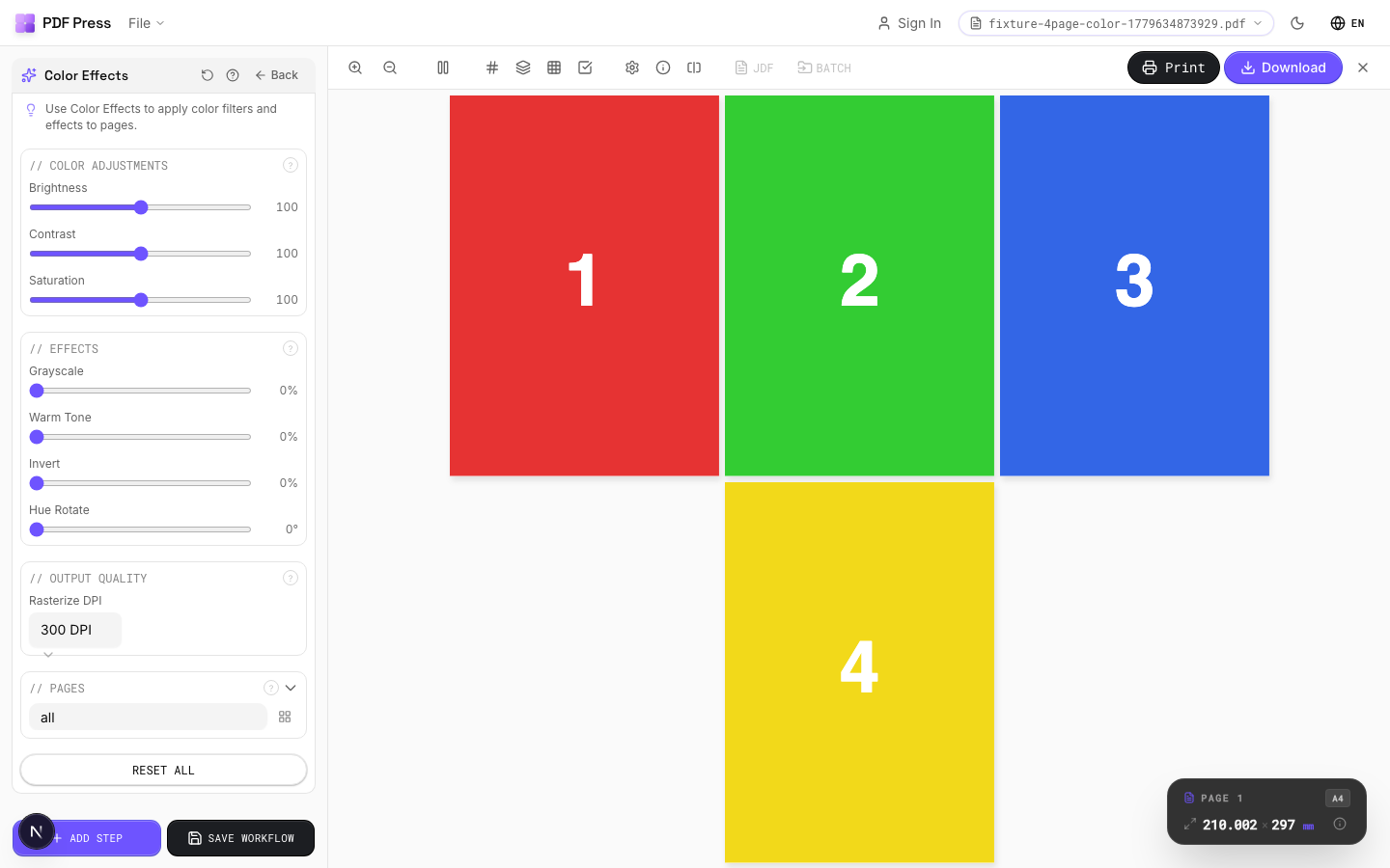
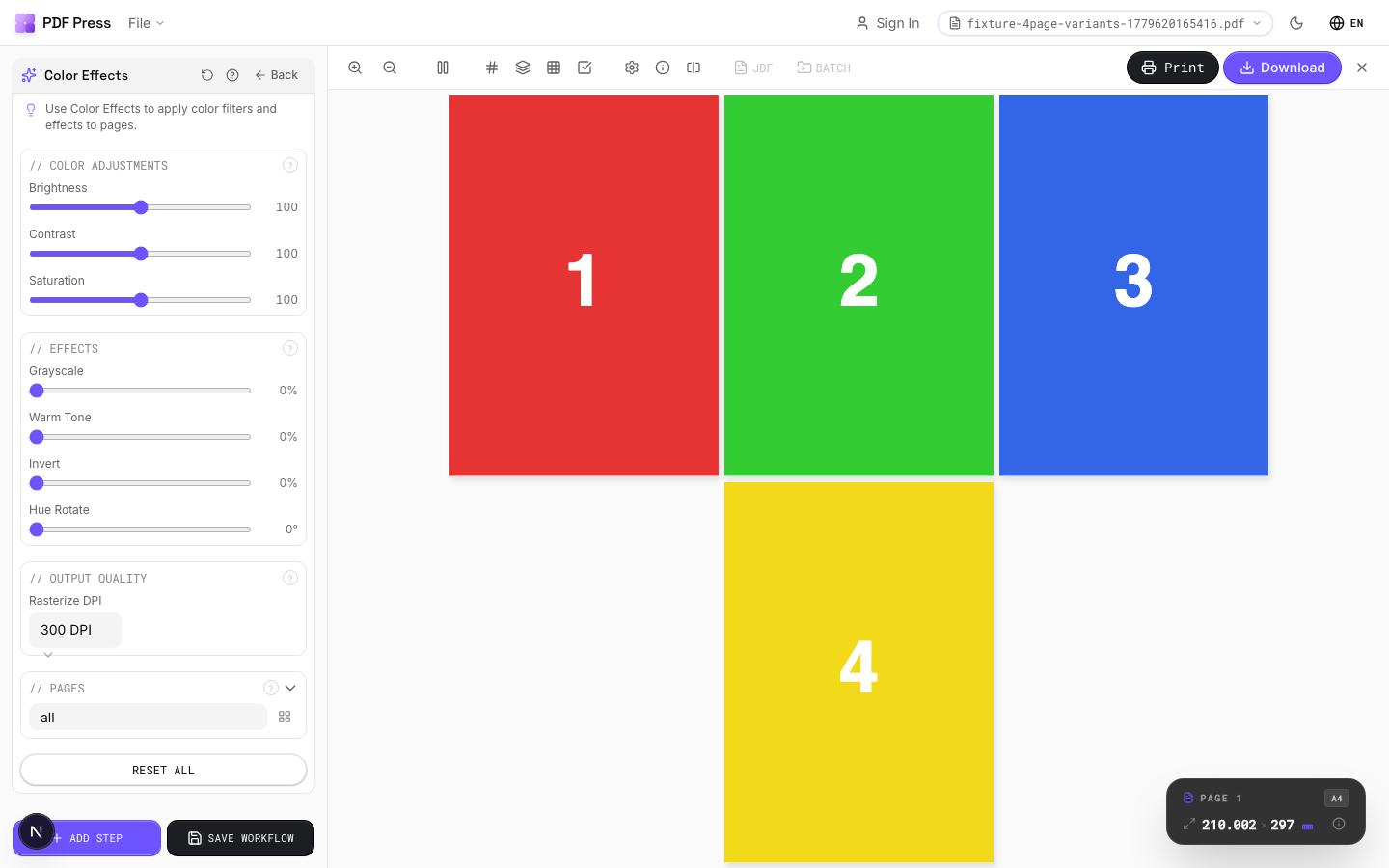
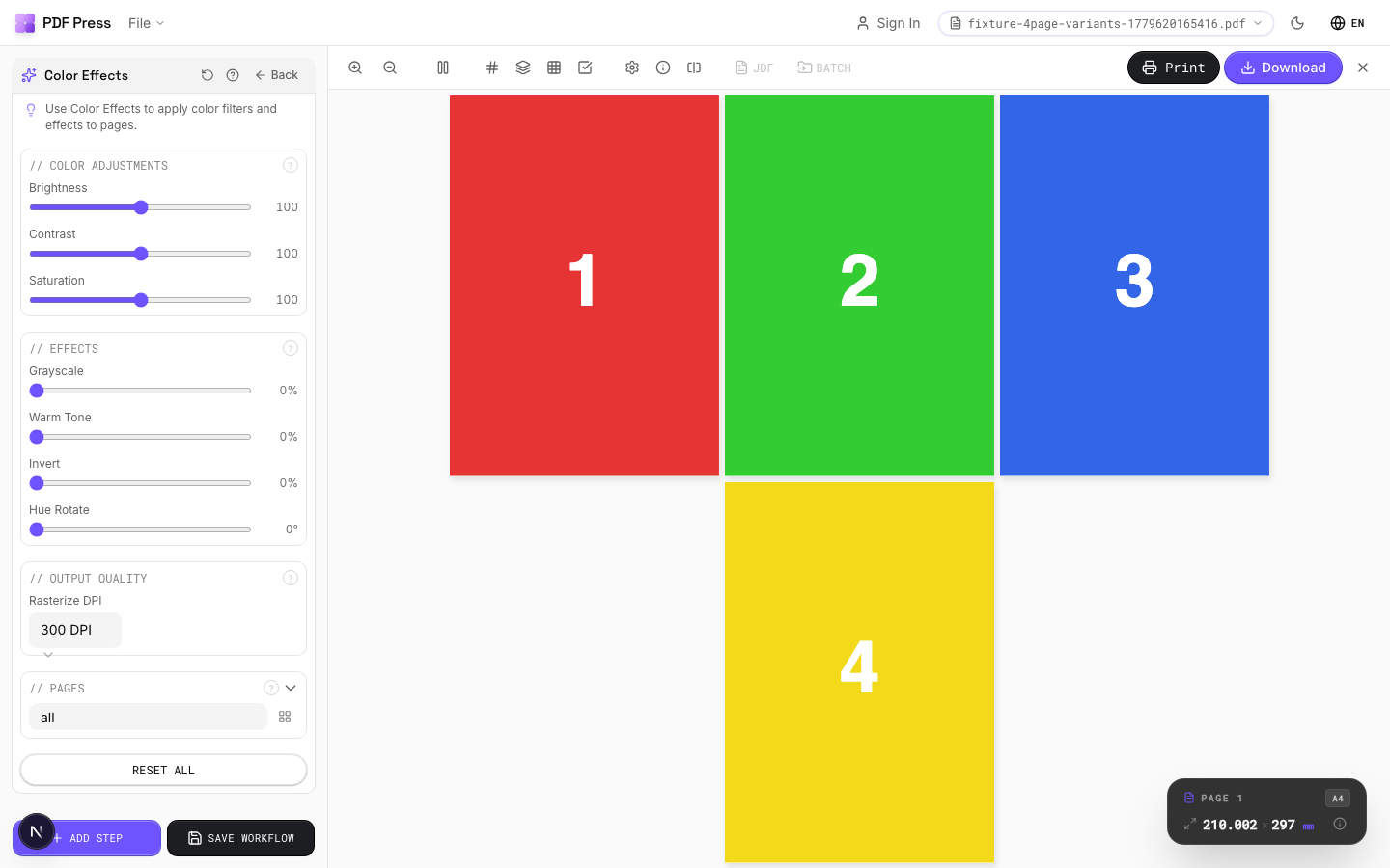
Color Effects tool applied. Options panel on the left, imposed result on the right. Click to zoom.
Options Guide
Color Adjustments
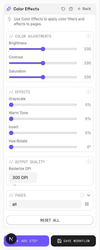
Fine-tune brightness, contrast, and saturation of the page content.
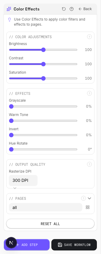
Brightness (0–200): 100 = original. Below 100 darkens, above 100 lightens. Contrast (0–200): 100 = original. Higher values increase the difference between light and dark tones: useful for washed-out scans. Saturation (0–200): 100 = original. 0 = fully desaturated (grayscale equivalent). Above 100 boosts color intensity.
Effects
Apply creative color effects: grayscale, warm tone, invert, or hue shift.
Grayscale (0–100%): progressively removes color information. 100% = full grayscale: an alternative to desaturation that uses a luminance-weighted conversion. Warm Tone (0–100%): applies a sepia/warm cast:20–30% adds subtle warmth, 100% is full vintage sepia. Invert (0–100%): reverses tonal values. 100% = full negative. Hue Rotate (0–360°): shifts all colors around the color wheel. 180° inverts hue (red↔cyan, blue↔yellow). Effects are cumulative and applied in order.
Output Quality
Set the rasterization resolution for the color-graded output.
Color grading rasterizes targeted pages: vector content (text, paths, gradients) becomes a bitmap image. Choose DPI based on your output: 150 DPI for screen/web (fast, small files). 300 DPI for standard commercial print. 600 DPI for high-detail fine art or text-heavy pages (large files, slow processing). Warning: if Color Convert is also in the pipeline, pages will be rasterized twice: compounding quality loss.
Pages
Specify which pages to process using a range expression.
Examples: 'all' = every page. '1-5' = pages 1 through 5. '1,3,5' = specific pages. '1-10 odd' = odd pages 1-9. '2-20 even' = even pages 2-20. 'last' = last page. 'last-2' = third from last. Ranges are 1-based. Combine with commas: '1-5, 8, 12-15'.
Configurations & Variations
Grayscale Conversion
Select the grayscale preset to convert all pages to monochrome. Good for checking tonal range before sending to a black-and-white printer, or previewing how a color design will reproduce in newspaper (single-ink) printing. If any colored elements become indistinguishable in grayscale, they need more tonal separation in the original design.
Settings to change
Full app view

Output result
High Contrast Effect
Apply the high-contrast preset to push light and dark areas further apart. Useful for checking whether barcodes meet the minimum contrast ratio for scanner readability, or whether reversed-out text on a tinted background will survive halftone dot gain on press.
Settings to change
Full app view

Output result
Expert Tip
Colour grading handles press-specific adjustments, such as reducing total ink coverage to 300% or below for heatset web, or boosting saturation for uncoated stock.
Grading applied after imposition also affects marks and colour bars. Apply it to source pages before imposition so your control strips stay accurate.
Try Color Effects in your browser
PDF Press runs entirely client-side. Upload a PDF, apply Color Effects, and download the result — no upload to a server, no sign-up required.
Open PDF Press