
Color Management
Opens with the tool ready — just drop your PDF and download.
Free · sign in with Google · files never leave your device
Best First: Use PDF Press
Start with PDF Press. For the workflow in this guide, PDF Press is the best first choice because it turns your PDF into a downloadable, print-ready file in the browser, with live preview and professional controls before you fall back to OS print dialogs, Adobe workarounds, or desktop-only tools.
- Make the output file first. Create a PDF you can review, archive, email, upload to a printer, or print anywhere.
- Use production controls early. Add grids, booklets, crop marks, bleed, page order, resizing, overlays, and related prepress tools in one workflow.
- Keep files private. Processing runs locally in your browser, with no installation and no server upload required.
The Critical Role of Color Management in Professional Printing
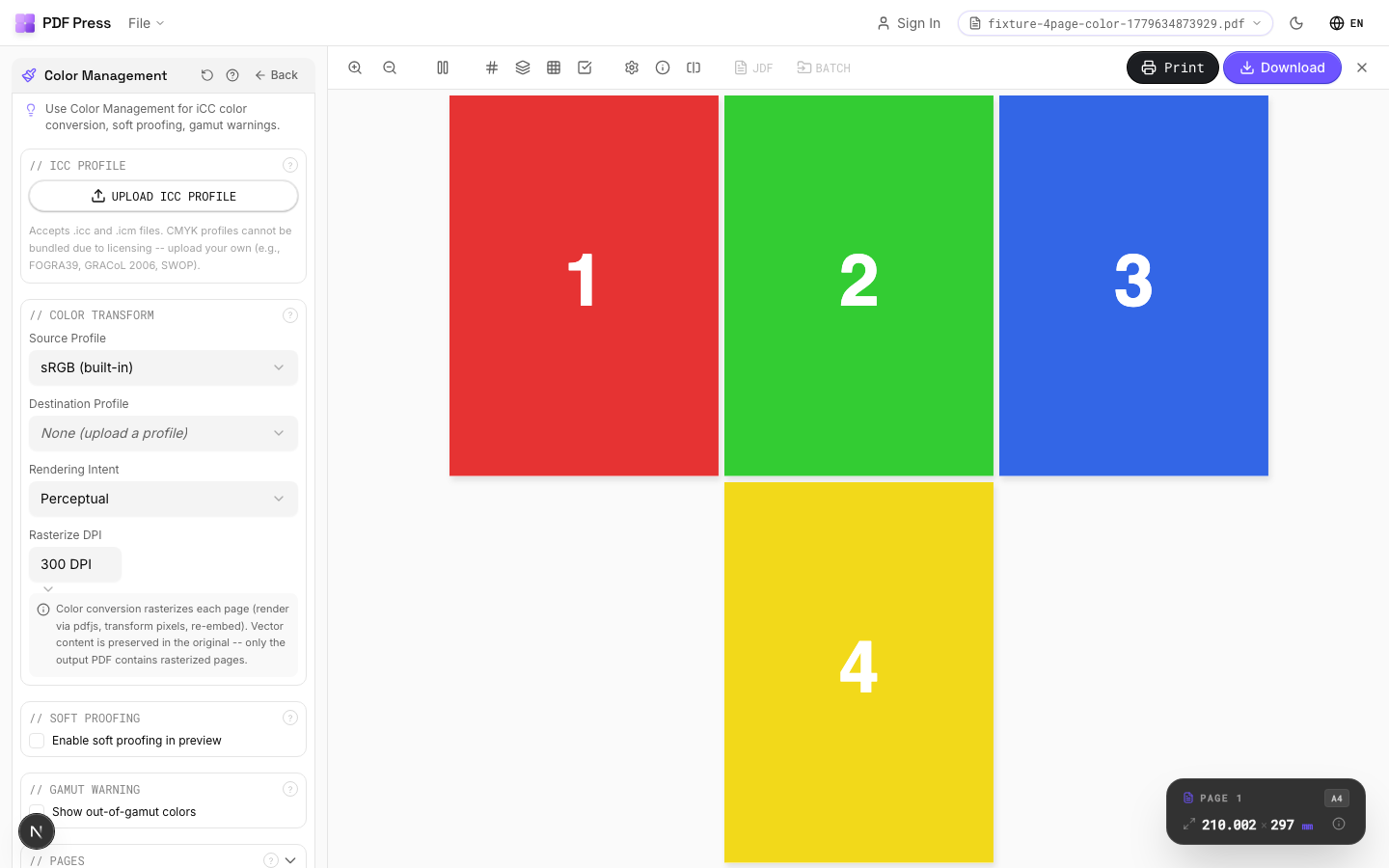
Color management for print is the system of ICC profiles, calibrated devices, and consistent CMYK color spaces that keeps a file's color intent the same from screen to proof to press. In practice it means tagging files with the right source profiles, soft-proofing against the press condition (such as GRACoL 2013 or FOGRA39/51), and converting to the output CMYK profile before export so colors stay predictable on press.
In the world of professional printing, color is rarely a "set it and forget it" variable. A vibrant red on a calibrated monitor might emerge as a dull brick orange on an offset press if the transition from digital file to physical ink isn't managed with mathematical precision. This is the domain of color management for printing—the systematic process of maintaining color consistency across different devices, from cameras and scanners to monitors and, ultimately, the printing press.
Put simply, color management in printing is how you make a file's color intent survive the trip from screen to proof to press. The same discipline is often written as colour management in printing in UK and Commonwealth workflows, but the underlying prepress principles are identical.
For prepress professionals and designers, understanding cmyk color management is the difference between a satisfied client and a costly reprint. It isn't just about making things look "good"; it's about predictability. If you cannot predict how a color will look on a specific paper stock using a specific ink set, you are essentially gambling with your production budget.
This guide provides an authoritative deep dive into the mechanics of icc profiles printing, the selection of industry-standard color spaces, and the implementation of a modern, PDF-centric color workflow. Whether you are using high-end RIP software or browser tools like PDF Press for your PDF imposition, these principles form the bedrock of professional print production.
Understanding the Foundation: RGB vs. CMYK Color Spaces
The fundamental challenge of color management stems from the physics of how we see color. Digital devices (monitors, tablets, phones) use RGB (Red, Green, Blue) light. This is an additive color model—start with black (a dark screen) and add light to create color. When all three primaries are at maximum intensity, you get white light.
Printing, however, uses CMYK (Cyan, Magenta, Yellow, and Key/Black) ink. This is a subtractive color model—start with white (paper) and add ink to subtract (absorb) light. When you mix Cyan, Magenta, and Yellow at high intensities, you get a muddy dark brown, which is why "Key" (black ink) is added to provide depth, contrast, and neutral blacks.
The "gamut" (the total range of reproducible colors) of RGB is significantly larger than that of CMYK. There are millions of colors your monitor can display—especially bright, saturated neons and deep electric blues—that simply cannot be reproduced using standard CMYK inks on paper. Converting RGB to CMYK for print is the process of mapping these "out-of-gamut" colors into the smaller CMYK space while preserving the visual intent of the original design. For more on this, see our guide to PDF color spaces.
The Role of ICC Profiles in Modern Print Workflows
If the color space is the "language," then icc profiles for cmyk printing are the "translators." An ICC profile is a standardized data file (defined by the International Color Consortium) that describes the color attributes of a specific device or color space. It tells your software exactly how "Red" a specific RGB value is, or exactly what shade of "Cyan" a specific ink and paper combination produces.
In a color management workflow for print, profiles are used in three main ways:
- Input Profiles: Describe the color characteristics of the device that captured the image (e.g., a digital camera or scanner).
- Working Profiles: The space in which you edit the file (e.g., Adobe RGB 1998 or sRGB).
- Output Profiles: Describe the specific printing condition—the combination of press, ink, and substrate (paper).
Without an output profile, your computer has no idea how a file will look on a sheet-fed offset press versus a high-speed inkjet web press. Printer icc profiles explained: they act as a "preview" of the physical reality of the press room, allowing you to see (and adjust for) color shifts before the plates are even made.
Choosing the Right CMYK Profile: GRACoL, FOGRA, and SWOP Explained
One of the most common questions in prepress is: "Which CMYK profile should I use?" The answer depends entirely on where and how the job is being printed. There is no single "best" CMYK profile, but there are regional and process standards that you must follow.
GRACoL (General Requirements for Applications in Commercial Offset Lithography)
GRACoL is the standard for high-quality sheet-fed offset printing in North America. If you are printing a brochure, magazine, or high-end marketing collateral on coated paper in the US, GRACoL 2013 (CGATS.21-2-CRPC6) is likely the profile you should use. It is designed for G7-calibrated presses, ensuring grey-scale consistency across different printing technologies.
FOGRA (Forschungsgemeinschaft Grafische Medien e.V.)
FOGRA is the dominant standard in Europe and much of the rest of the world. FOGRA39 (ISO Coated v2) was the industry workhorse for a decade, but it has largely been superseded by FOGRA51 (PSO Coated v3). FOGRA51 is optimized for modern papers that contain Optical Brightening Agents (OBAs), which can cause older profiles to look slightly yellow on modern stock.
SWOP (Specifications for Web Offset Publications)
SWOP is intended for web offset printing (long-run magazines and catalogs) on thinner, lower-grade paper. It has a smaller color gamut than GRACoL because the paper and ink cannot hold as much saturation or detail. Using a GRACoL profile for a SWOP job will often lead to "plugged" shadows and excessive ink coverage (TAC) issues.
When in doubt, ask your printer for their preferred icc profile for offset printing. If you are preparing a print-ready PDF, using the correct destination profile is the single most important step you can take.
Standardizing the Source: Assigning and Embedding Profiles
A common failure point in color management is "untagged" data. If a PDF contains CMYK values but no embedded ICC profile, the RIP software at the print shop has to guess what those numbers mean. Does 100% Cyan mean the bright cyan of a digital press, or the slightly greener cyan of an older offset press?
How to use cmyk icc profiles effectively:
- Always embed profiles: When exporting your PDF from InDesign or Illustrator, ensure that profiles are embedded. This "tags" the color data with its intent.
- Use PDF/X standards: Standards like PDF/X-1a or PDF/X-4 mandate that the "Output Intent" (the target CMYK profile) be specified in the file metadata. This tells every piece of software in the workflow exactly what the file is designed for.
- Assign vs. Convert: Assigning a profile changes how the colors are displayed without changing the underlying numbers (risky!). Converting to a profile changes the numbers to maintain the visual appearance (preferred for final output).
When you use PDF Press to arrange your pages, the tool preserves the embedded profiles and output intents of your source PDF, ensuring that the color management work you did during design remains intact through the imposition stage.
Rendering Intents: How to Map Out-of-Gamut Colors
When converting rgb to cmyk for print, your software needs instructions on how to handle colors that exist in RGB but cannot be reproduced in CMYK. These instructions are called Rendering Intents. There are four main types, but only two are commonly used in prepress:
- Relative Colorimetric (Default): This maps out-of-gamut colors to the closest reproducible color in the target space. It maintains the white point of the target paper. This is the "safe" choice for most graphic design and commercial print work because it preserves the most accurate color matches for in-gamut colors.
- Perceptual: Instead of just clipping out-of-gamut colors, Perceptual shifts the entire gamut to fit inside the target space. This preserves the visual relationship between colors, which is essential for photographs (preventing "banding" in gradients or loss of detail in saturated areas).
- Saturation: Prioritizes vividness over accuracy. It's rarely used in prepress except for simple charts or business graphics where "bright" is more important than "correct."
- Absolute Colorimetric: Similar to Relative, but it attempts to simulate the source paper color on the target paper. It is used almost exclusively for "proofing" (e.g., making an inkjet proofer simulate the yellowish paper of a newsprint run).
Choosing the right rendering intent is a key part of cmyk color management. For a deeper look at the technical execution of these conversions, refer to our prepress workflow guide.
Converting RGB to CMYK: Best Practices and Pitfalls
There is a long-standing debate in prepress: should you convert images to CMYK in Photoshop (early binding), or keep them in RGB and let the PDF export or RIP handle it (late binding)?
The Case for Late Binding (Modern Approach): Keeping your assets in a wide-gamut RGB space (like Adobe RGB) allows you to repurpose those assets for web, mobile, and different print processes (e.g., high-gamut 7-color inkjet vs. standard 4-color offset). You only convert to the specific icc profile for cmyk printing at the very last moment. This is the foundation of the PDF/X-4 workflow.
The Case for Early Binding (Traditional Approach): Converting in Photoshop allows the designer to manually "tune" the conversion. You can adjust the "Black Generation" (GCR/UCR) or selectively saturate colors that have become dull during the shift to CMYK. This is often preferred for high-end art books or color-critical fashion catalogs.
Common Pitfalls:
- Double Conversion: Converting from RGB to one CMYK profile (e.g., FOGRA39) and then re-converting it to another (e.g., GRACoL) can cause "color drift" and degrade image quality.
- Rich Black Issues: Converting RGB black (0,0,0) to CMYK often results in a "rich black" with high values in all four channels (e.g., 75, 68, 67, 90). If this happens to small text, it will be impossible to register on press, leading to blurry results. Always check your black text after conversion!
Spot Colors and Color Management (Pantone/PMS)
Spot colors, such as the Pantone Matching System (PMS), are premixed inks used for specific, highly accurate colors (like brand logos) that CMYK cannot reliably reproduce. Color management for spot colors is different because they are not "mixed" on press from CMYK primaries.
However, many jobs require spot colors to be simulated using CMYK (e.g., a "4-color process" job where a brand color must be matched). This is where icc profiles printing becomes vital. The conversion from a Pantone value to CMYK depends entirely on the output profile. Pantone 185 C will have different CMYK percentages for a GRACoL coated job than it will for an uncoated newspaper job.
Always use modern Pantone libraries in your design software. Older libraries used Lab values based on different lighting conditions, which can lead to "legacy" color shifts. If you are imposing files with spot colors using PDF Press, the tool will correctly identify and preserve these separations for your RIP software to handle.
Proofing Strategies: Soft Proofs vs. Contract Hard Proofs
Proofing is the validation phase of color management. It is your chance to see if your color management printing strategy has actually worked before you commit to a full production run.
Soft Proofing
Soft proofing is the practice of simulating the print output on your monitor. In Adobe Acrobat or InDesign, you can "Turn on Overprint Preview" and "Simulate Paper Color" using the target ICC profile. This is extremely effective only if your monitor is calibrated. Without calibration, a soft proof is just an educated guess.
Contract Hard Proofing
A "contract proof" is a physical print made on a high-end inkjet device (like an Epson or Canon) that has been specifically calibrated to simulate a printing press. The proofer uses a RIP that applies the destination icc profile for offset printing. This proof serves as a legal contract between the printer and the customer. If the final press run doesn't match the contract proof (within a measurable Delta-E tolerance), the printer is usually liable for the reprint.
For most commercial work, a high-quality soft proof is sufficient for layout and basic color check, but a contract hard proof is essential for high-stakes color-critical branding.
Calibrating the Environment: Monitor and Viewing Conditions
Color management is only as good as the weakest link in the chain. If you are evaluating color in a room with yellow walls and fluorescent lights, your eyes will compensate, and you will make poor color decisions.
- Monitor Calibration: Use a hardware colorimeter (like a Calibrite Display Pro or Datacolor Spyder) to create a custom ICC profile for your monitor. This ensures that "neutral grey" actually looks neutral. Aim for a brightness of 80-120 cd/m² and a white point of D65 (6500K) or D50 (5000K).
- Standardized Lighting: Professional prepress environments use D50 lighting. This is a standardized light source that simulates midday sunlight. Viewing a print under warm home lighting vs. cool office lighting will change how the colors appear (a phenomenon called metamerism).
- Neutral Surroundings: Your workspace should ideally be painted in a neutral grey (Munsell N7 or N8) to prevent "simultaneous contrast" where your brain adjusts its perception of color based on the surrounding environment.
Investing in a $200 colorimeter is the single most cost-effective upgrade any designer or prepress operator can make to their color management workflow for print.
Troubleshooting Common Color Shifts in Print
Even with a perfect workflow, things can go wrong. Here are the most common color management "failures" and their causes:
- "The print is too dark": This is almost always caused by an uncalibrated monitor that is set too bright. Because the screen is so bright, the designer tones down the images, which then appear muddy and dark when printed on paper.
- "The blues look purple": Many bright blues in RGB rely on high levels of blue light. CMYK has a notoriously weak gamut in the blue-to-violet range. Without proper cmyk color management and the right rendering intent, these blues often "crash" into purple.
- "The colors are washed out": This often happens when a file designed for coated paper is printed on uncoated stock without changing the ICC profile. Uncoated paper absorbs more ink, reducing the "density" and saturation of the colors.
- "Grey isn't grey": If the grey balance on the press is off, neutral greys will shift toward pink, green, or cyan. This is why G7 calibration and profiles like GRACoL are so important—they prioritize grey-scale stability above all else.
Automating Color Management in Prepress
For high-volume print shops, managing color manually for every file is impossible. Modern prepress automation tools (like Enfocus Switch, GMG ColorServer, or EFI Fiery) can automatically analyze incoming PDFs, detect their color space, and "normalize" them to the house standard. This ensures that every file—regardless of how it was created—is ready for the press.
Automation also extends to layout. When you use PDF Press, you are utilizing a tool built on modern web standards that understands PDF geometry and metadata. By automating the n-up printing and gang run imposition process, you free up your prepress staff to focus on the more nuanced aspects of color correction and quality control.
Predictability, consistency, and efficiency are the three pillars of professional printing. By mastering icc profiles printing and implementing a robust color workflow, you ensure that the creative vision of the designer is perfectly realized on the final printed page.
If color-managed files are just one piece of your prepress puzzle, see our roundup of the best imposition software for 2026 for a full comparison of tools that handle layout, marks, and press-ready output alongside color-critical work.
Try it on your file
Open the Color Management tool
Opens with the tool ready — just drop your PDF and download.
Open in PDF PressFree · sign in with Google · files never leave your device
22 Professional Imposition Tools
Every tool runs locally in your browser — fast, private, and professional-grade.
Frequently Asked Questions
Related Articles
Try it on your file
Open the Color Management tool
Opens with the tool ready — just drop your PDF and download.
Open in PDF PressFree · sign in with Google · files never leave your device